Subway Startups Survey: Edition I

Welcome to our first quarterly installment of the C42D Subway Startups Survey. The Subway Startups Survey is a review of the brands we see plastered on the walls in NYC subway cars and stations on our daily commute.
We’re not the only folks to notice the takeover of NYC Subways by startups. Honestly, it’s hard to miss, and as designers, we’re always spotting what’s on-trend in the No. 1 market in America.
So, without any further delay, here’s our very first review of Subway Startups, in no particular order:
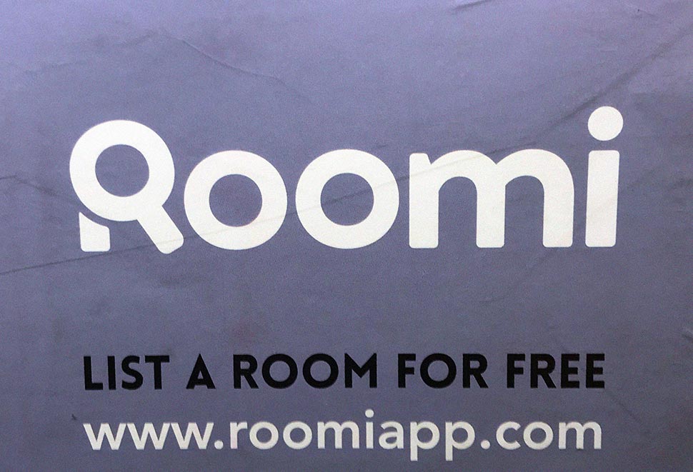
No. 1: Roomi
Vertical: Real Estate
Tagline: Find roommates who get you
Total Funding to Date: 17M
Target: Millennials with crappy roommates
Pain Point Solved: Potential serial killers from Craigslist becoming your next roommate

The Concept:
Since Compass came on the scene, the tech-enabled real estate startup is the new skinny margarita. Roomi takes it to another level by uber-izing the roommate vetting process. What could be better than pushing a button and having the perfect roommate appear at your door? Before you know it, you’ll be chilling in the back-yard over sangria served in mason jars with your new Roomi strumming his acoustic guitar.
Why we Dig This Brand:
The logo font has just the right amount of friendliness without becoming too soft or goofy. Clever use of the magnifying glass is employed, a tactic which usually gets implemented in a not-so-clever way. Roomi’s tagline speaks directly to the value delivered to the end user – after all, who doesn’t want someone who “gets” them? The website, however, while functional, clean and easy to navigate, feels a little like the second iteration from the MVP. But overall this brand works. Ah, if only this service existed 20 years ago…
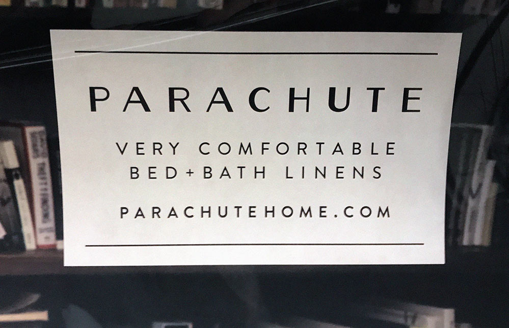
No. 2: Parachute
Vertical: Consumer Home Goods
Tagline: Very comfortable bed + bath linens
Total Funding to Date: 14.8M
Target: Millennials with 100 thread count sheets
Pain Point Solved: Better quality sleep tonight = fewer road rage incidents tomorrow

The Concept:
With Bed, Bath & Beyond and traditional retail on life support, the blue sky for direct-to-consumer linens has never been bluer. And who can deny the world is a better place with Parachute building “a community around sleep, wellness and creating a more comfortable home”? In short, get awesome linens, and realize a better life.
Why we Dig This Brand:
Put simply, the logotype is incredibly on-trend and just kills it in our opinion. This design looks like it could be from a 1920’s ad but still comes off as very 2018. The future-retro look pays off the Italian heritage story – even if it’s not true. Parachute’s brand fonts feature a complementary pairing of serif and sans that work well with the logo. Their black and white color scheme is straight outa’ Chanel, but hey if it works… work it.
Overall, this brand makes us want to buy new sheets, and our sheets are already totally awesome, so something is working well. Finally, don’t overlook the fantastic naming choice of Parachute which evokes… well, the softest, pillowy, feeling imaginable. At only 14.5M in funding, this brand feels much more advanced and mature for where they are in the startup lifecycle. Killer bang-for-buck ratio, gals!
No. 3: SeatGeek
Vertical: Sports & Entertainment
Tagline: Millions of tickets in one place
Total Funding to Date: 160M
Target: Millennials who want to see Beyonce, Jon Stewart, or the Yankees vs. Redsox but totally folded when tickets went on sale
Pain Point Solved: Far from being a goat, you’re the hero with the perfect seats (and a huge Mastercard bill)

The Concept:
We all know Ticketmaster is the Evil Empire, and StubHub was so last decade. With SeatGeek, you know you are getting the lowest price because their AI robots are finding badass deals that mere mortals could not. SeatGeek searches all the other ticket sites— it’s basically Kayak for tickets—so you get every possible option in the known Universe. (PS – when does Kayak for pizza come out)? Best of all, you know exactly how to find your section because their interactive 3D maps provide every detail down to the gum stuck under the seats you just spent $1200 on.
Why we Dig This Brand:
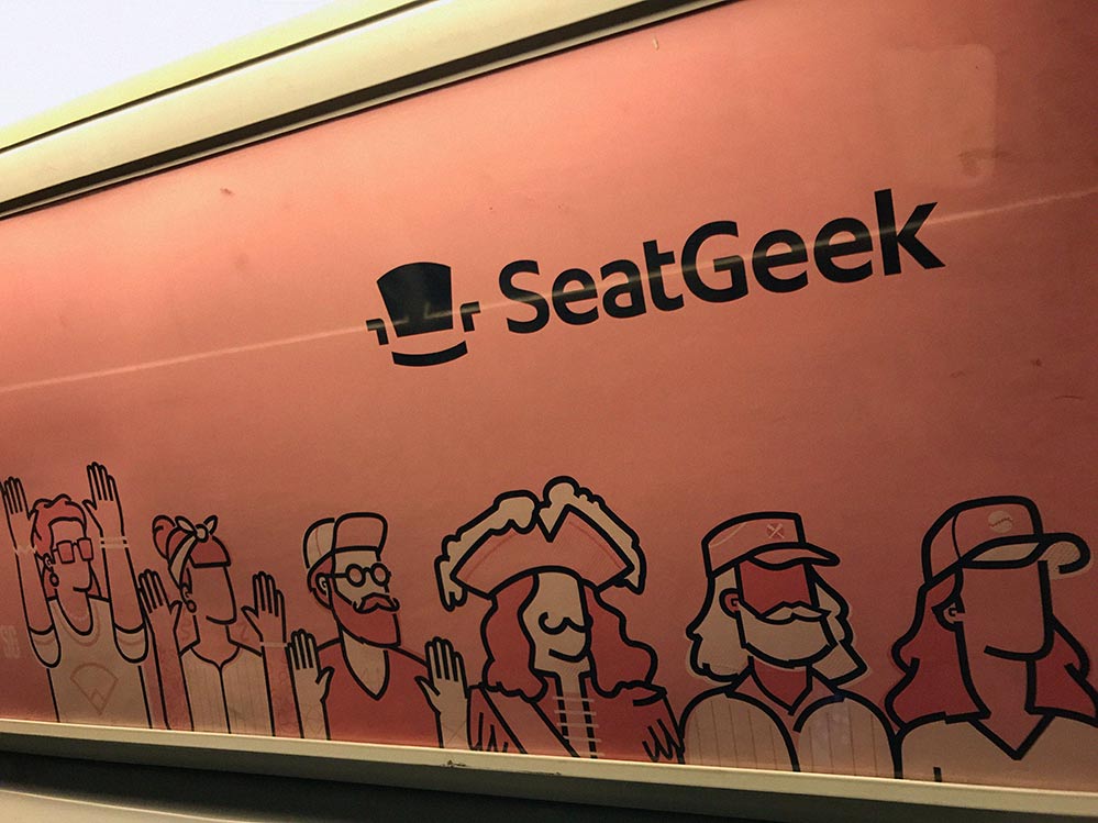
We loved the logo at first sight. Yes, it’s a seat, but that seat is happy, son. He knows a secret we don’t, like where to find front row center tickets to Fleetwood Mac on the cheap. Their font adds to the logo mark, and the name itself is packed with assonance. The only sticking point we have with this brand is the tagline: “Millions of tickets in one place”… really? It’s all good, however, because the brand campaign (above) features an illustration style that captures coolness, diversity, fun, and inclusion all at once. Home run, seat geeks!
The Winner
It’s a tough choice between SeatGeek and Parachute, but we have to give this round to Parachute, based on the compelling story, excellent web site, beautiful name, and mature feel.
Well, that’s it, we hope you enjoyed this first edition of the Survey. Let us know your thoughts: Do you have a suggestion or a brand we should check out? Agree or disagree with our breakdown? If so, drop us a line in the comments section. Actually, we don’t have a comments section but feel free email us here for any feedback. Until next time, ride safe and don’t be jumping them turnstiles!
Photography by David Card. All trademarks are the property of their respective owners. Funding amounts as of 05/23/18 provided by CrunchBase.
If this article helped you, please help us by sharing it or recommending to a friend. Thank you!


