CHALLENGE
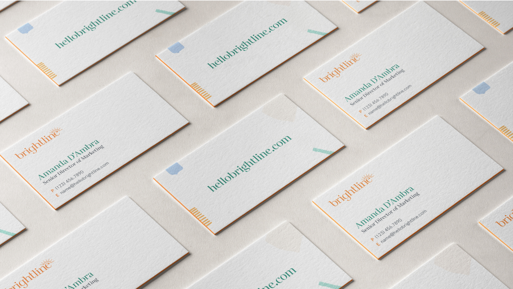
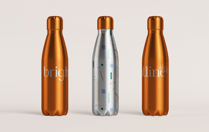
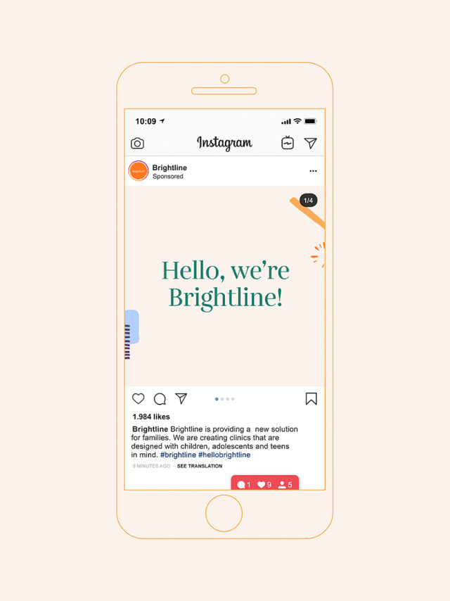
Brightline had secured funding and was in the process of moving towards a 2020 launch in California. When they engaged C42D, they had completed the basics of their brand strategy and were developing a new name for the company. C42D was tasked with advising on naming, developing creative based on the strategic goals of the brand, building the brand identity and visual expression of the brand, and how it would live across all touchpoints.
SOLUTION
As we do for every engagement, we applied our bulletproof process, starting with discovery and advising on the new name. With C42D’s input and guidance, the new name of Brightline was selected.
Brand Identity System
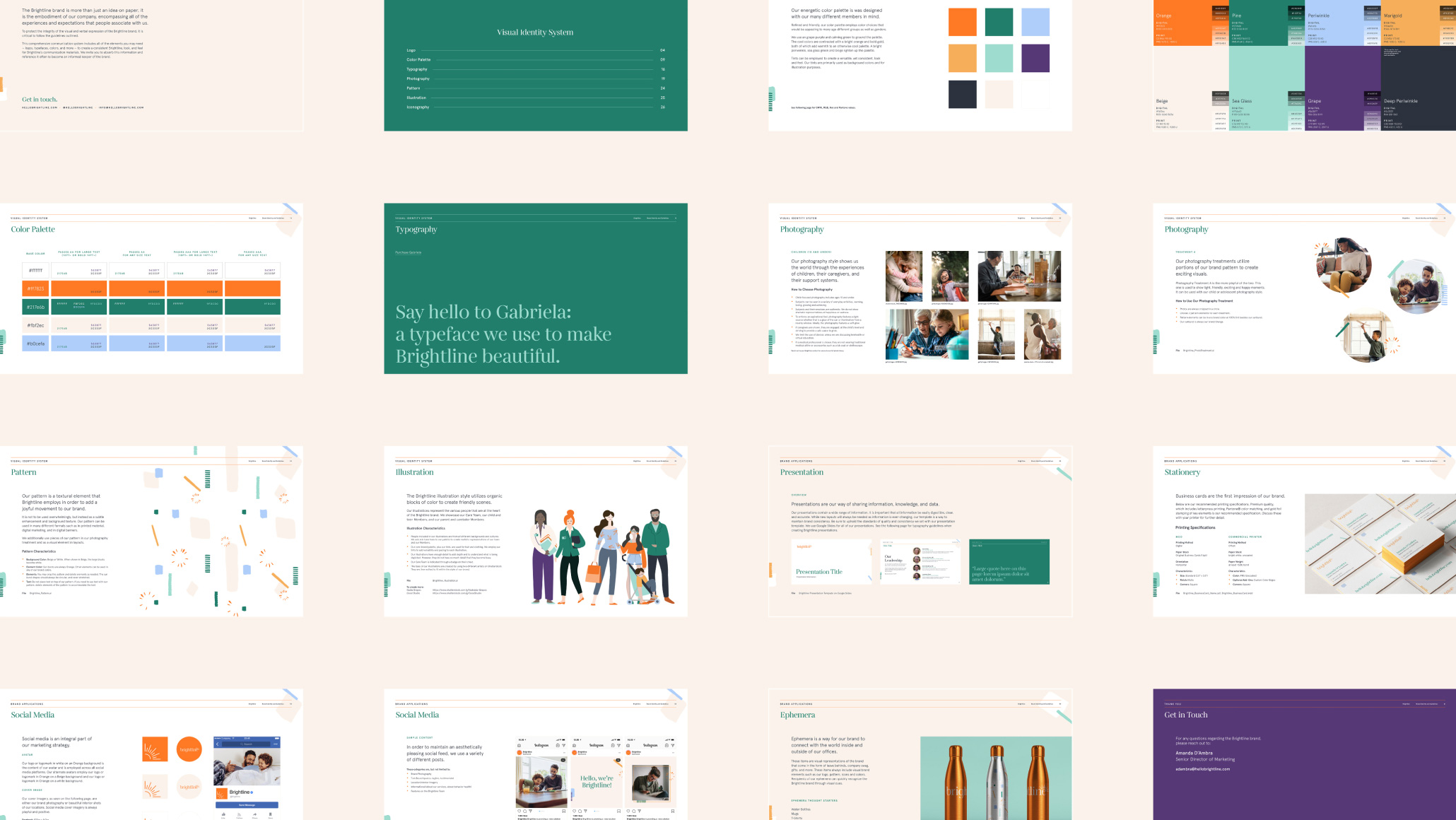
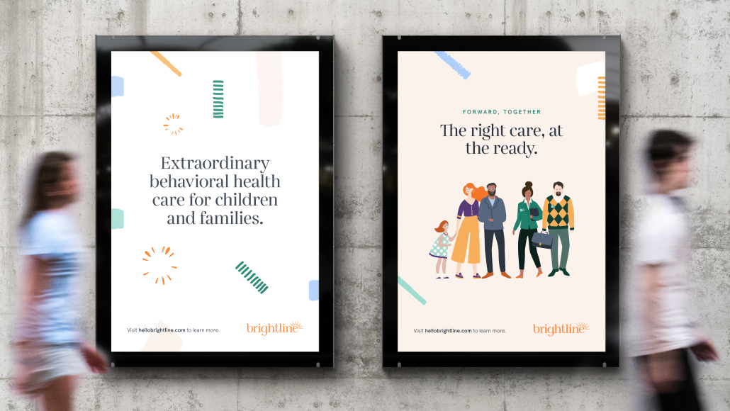
We created a design system that appeals to caregivers, kids, teens, and adolescents – while still feeling modern and trusting to parents. A welcoming color palette resonates with all genders. Beautifully crafted typography achieves softness and humility that is core to the brand strategy. We curated a photography style that views the world through the eyes of children, caregivers, and family units. Families can be seen in a variety of activities, growing, loving, and achieving together. The style employs warm tones and touches of natural light, encouraging an aspirational feel.
Visual elements, such as icons and illustrations, speak directly to Brightline members. While the iconography style is jovial, it is also literal and straightforward, using thin lines to inform members. Organic in form, Brightline illustrations capture the diversity of their member base.

