CHALLENGE
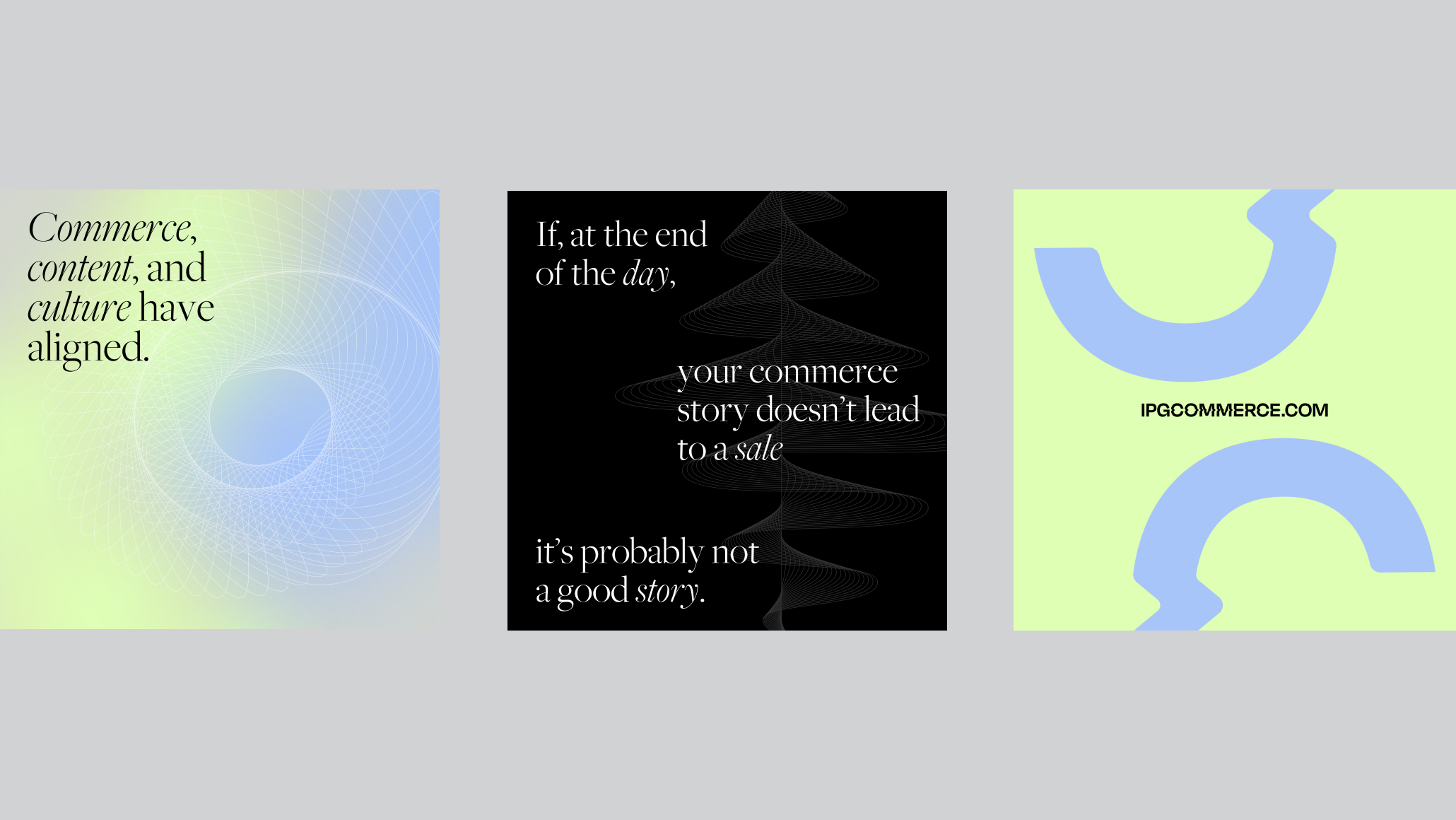
IPG Commerce is a sub-brand of International Holding Company IPG. Their Sr. Team approached C42D to help develop a brand that is seen as a strategic thinker with provocative ideas and an entertaining way of communicating that is focused on partnering with clients on their journeys of transformation and career success.
SOLUTION
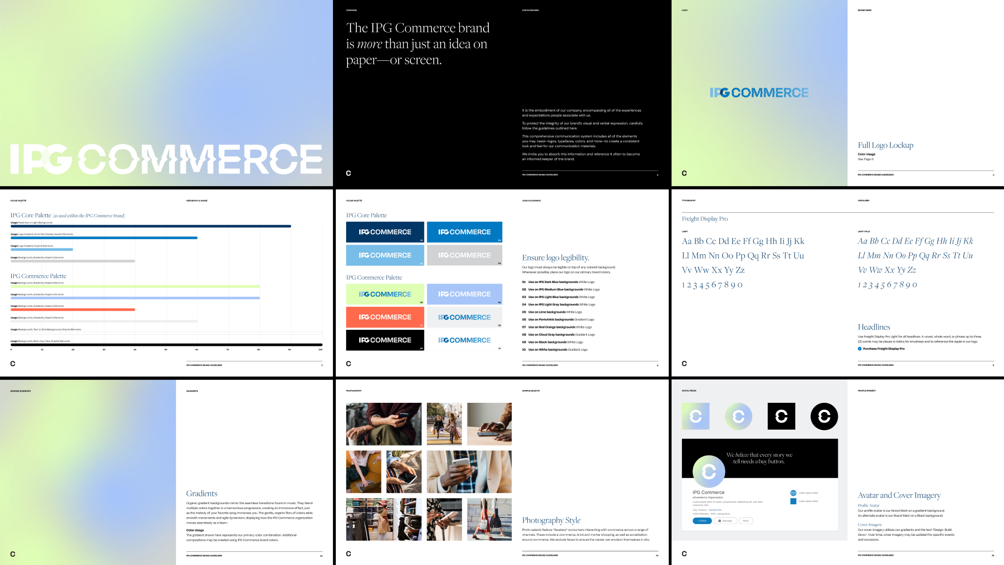
Creative territories for the visual identity were explored. Through analysis of the competition, areas of opportunity were identified for color, type, photography, and other design elements.
Several mood boards with accompanying design stories were then presented and a final direction was chosen.
The IPG Commerce visual language is built on the idea that IPG is meticulous in its client care. They help brands navigate the complexity of commerce to ensure success, as well as help them navigate the IPG network to make it easier to get what they need to enable that success.
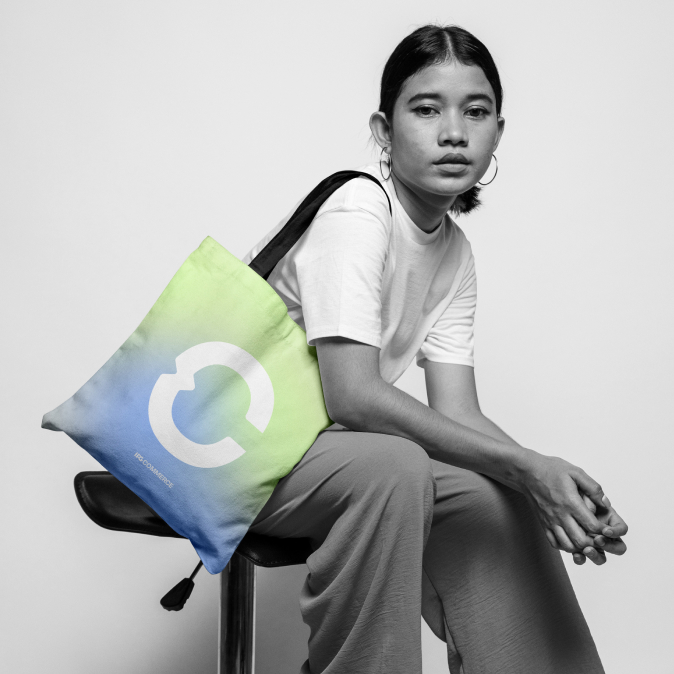
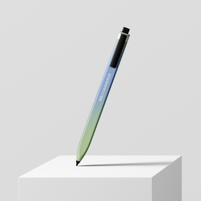
The color palette embodies a balance of vibrancy and grounded neutrality, creating a cohesive blend that is energetic while embracing simplicity, suitable for diverse contexts. A tranquil tea-colored green symbolizes growth and prosperity while blue radiates confidence and authority. Beiges and neutrals add gravity, reflecting IPG Commerce’s commitment to taking their clients and colleagues seriously.
Full-color photography focuses on authenticity and credibility, with neck-down compositions that invite viewers to picture themselves within the scene.