CHALLENGE
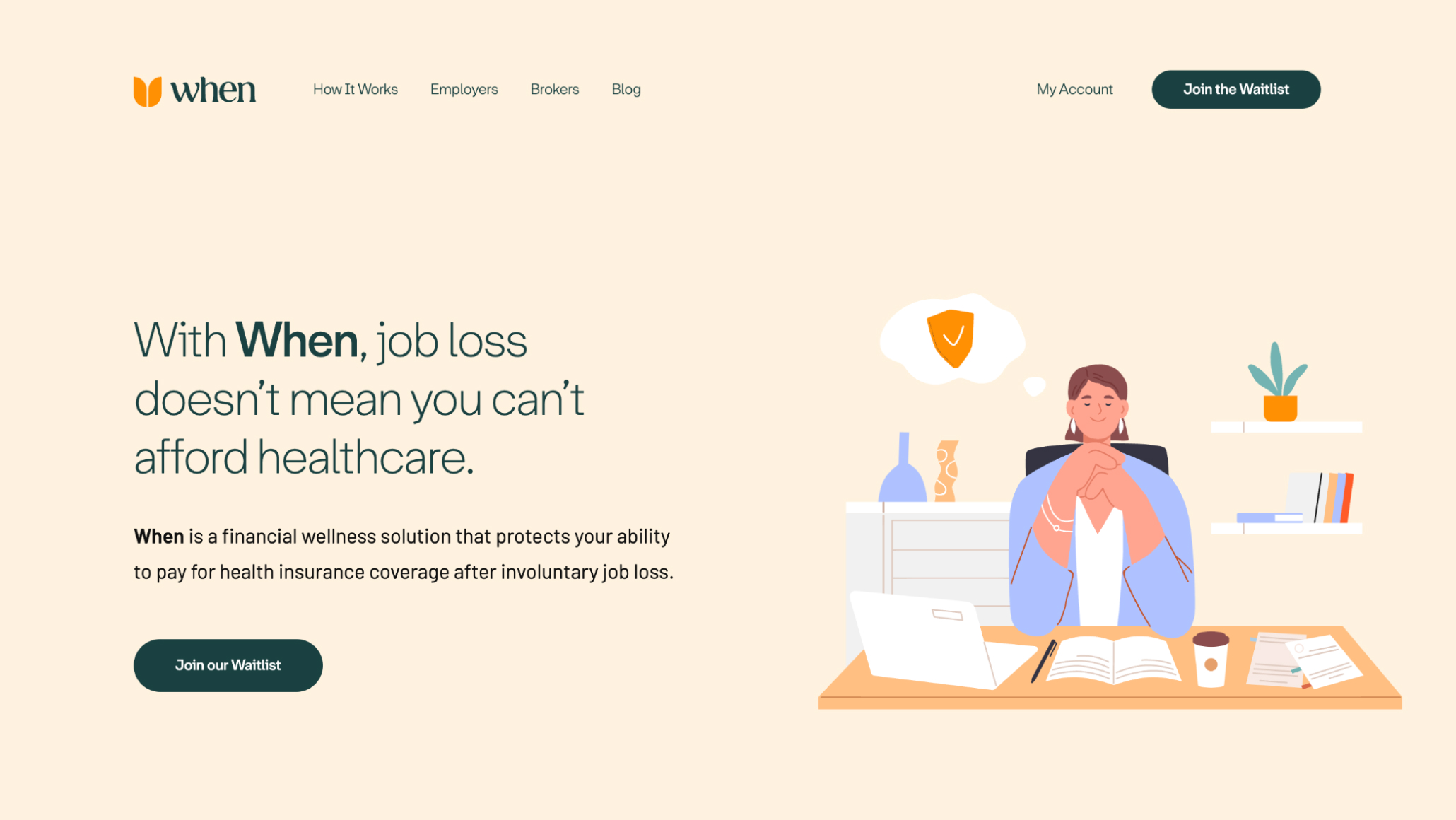
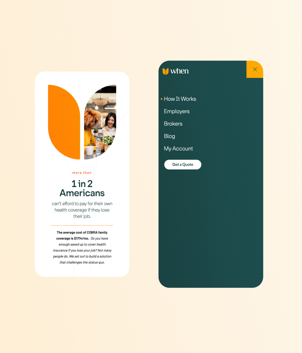
Nobody wants to think about losing their job, or what happens to their health insurance if they become unemployed. There is a solution to continue health insurance coverage while people are in between jobs—it’s called COBRA—but it can be prohibitively expensive for someone who just lost their regular paycheck.
When is insurance for your insurance. In a nutshell, employees sign up while employed, and they cover your COBRA gap coverage if you lose your job.
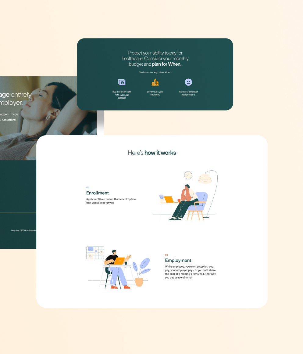
When was previously called “CobraSelect.” They hired C42D to do naming, brand strategy, brand identity, visual identity, and website.
SOLUTION
Solving for the When brand required a delicate balance of emotional appeal and solution-oriented thinking. People don’t like to think about health insurance or losing their job. When needs to not only drive this conversation, but also convince people that their startup has the solution.
1 – Mission
The first key step of this brand journey was being clear on When’s mission. Pivoting slightly from reactive messaging around job loss, C42D helped the team take a step back and focus on their core values. We focused on their core belief: every American has the right to access healthcare.
This way of thinking about their mission stepped them into a more confident stance for both the brand and their audience. Instead of apologizing for making people think about worst-case scenarios, the revised brand story became both a powerful no-brainer and a fundamental human cause.
2 – Naming
Naming was an important way to own the conversation around their solution. “CobraSelect,” while factually correct, reads more like a premium extension of an existing insurance product than a helpful solution.
“When” emerged as the clear winner, as a solution for when the worst-case scenario happens. There is a calm, nurturing, and humane presence to “When” that flies in direct contrast to the brutal reality of job loss.
3 – Visual identity
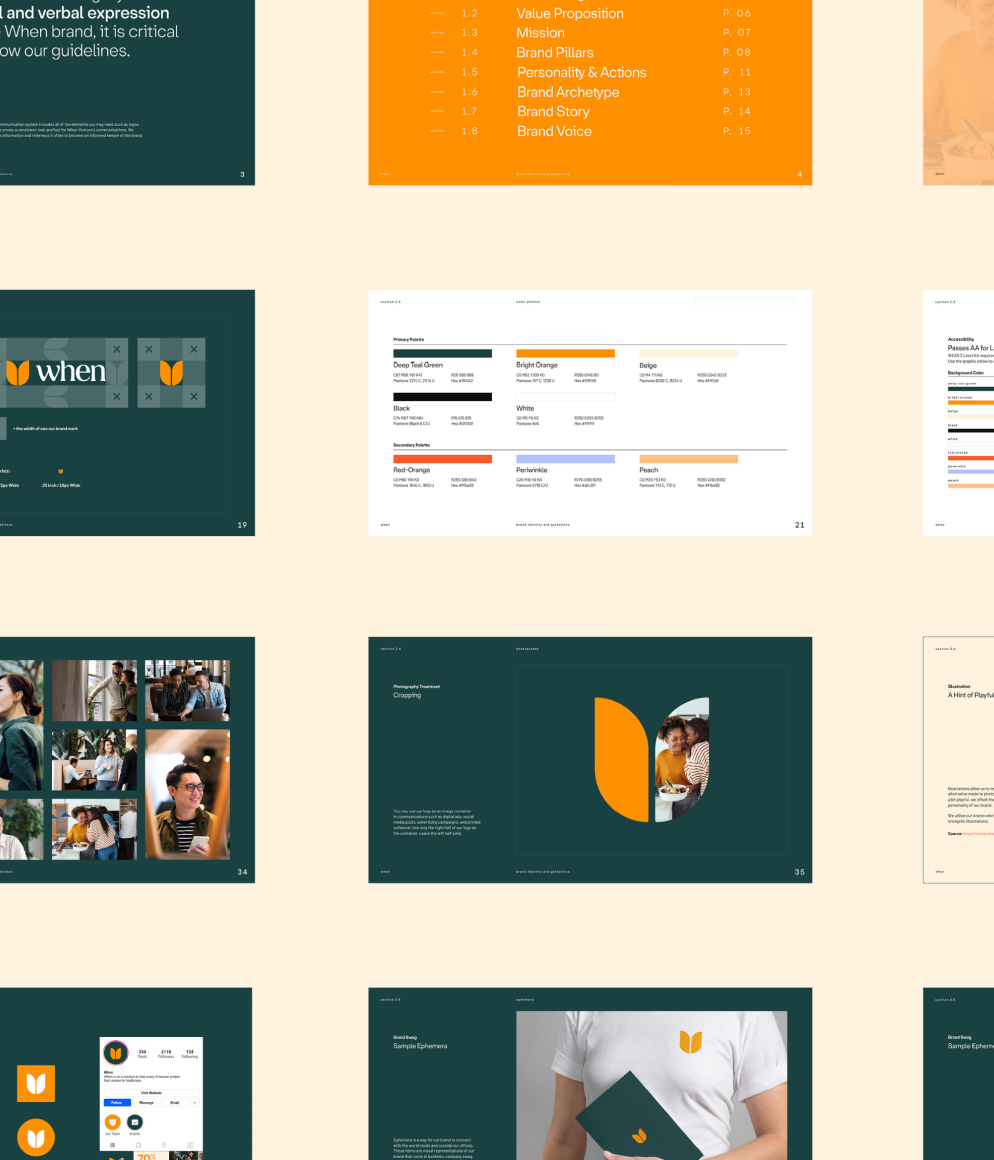
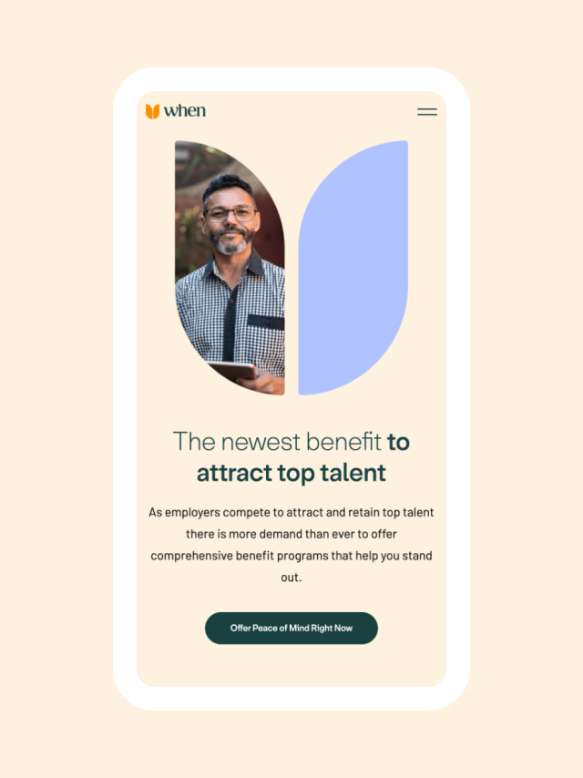
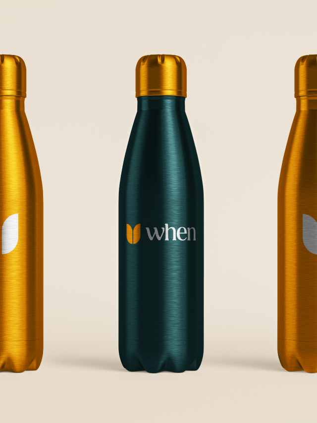
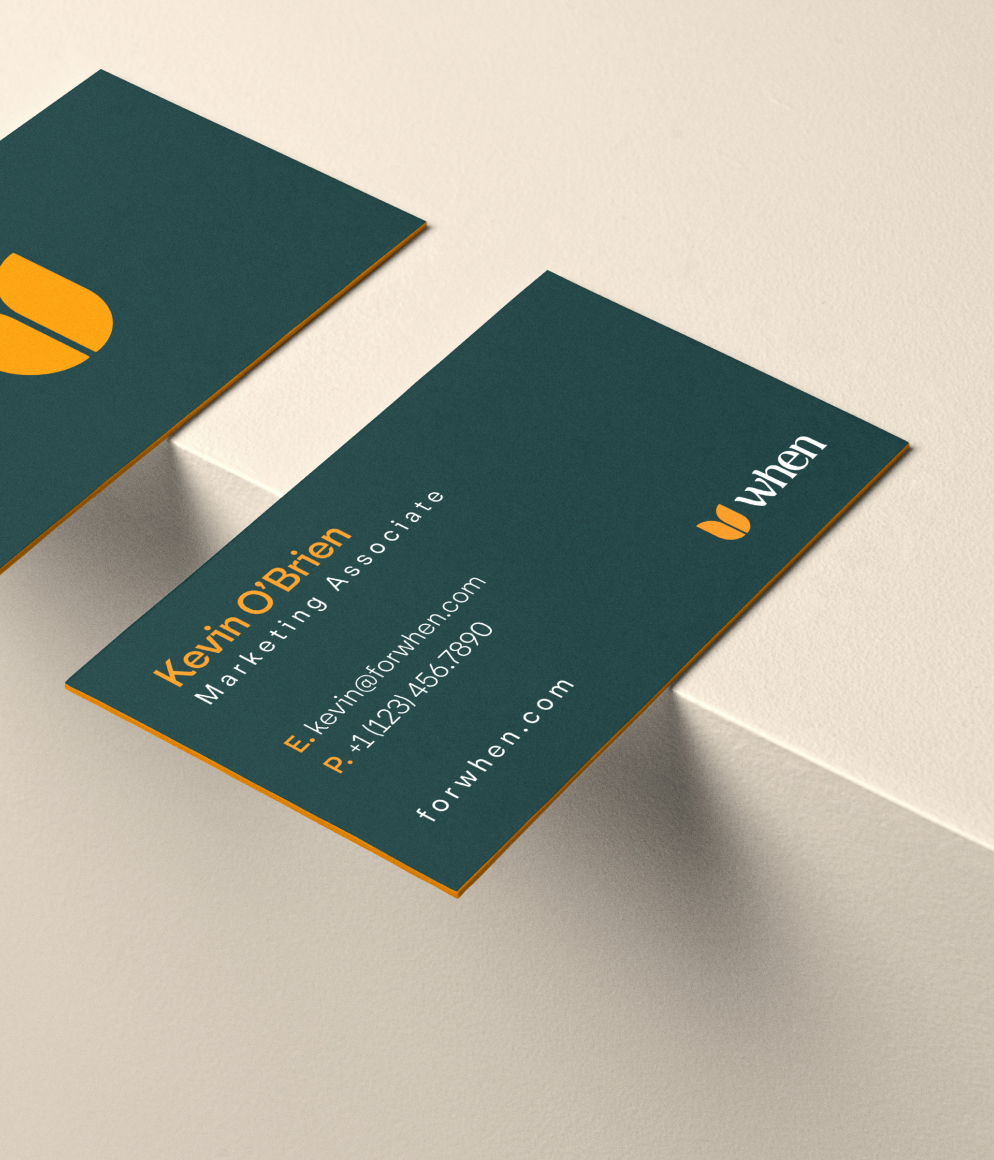
From here, C42D did a deep analysis of the competitive landscape, noting both major institutional players and a line of startups tackling different healthcare problems. The color palette for When rapidly unfolded from here, with a bold palette bearing organic roots that easily stood out from the colors everyone else was using. Deep teal signaled stability and new beginnings, shades of orange brought energy and enthusiasm, and a dash of periwinkle infused calm wisdom to the brand.
CobraSelect’s push-and-pull of struggle and relief visually transformed into When’s story of new beginnings and clarity, energy and transformation.
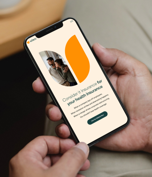
The initial direction around the brand’s logo went in the direction of polygons, but discussions led to a tulip motif. This soft plant is often among the first to bloom, its beautiful flowers appearing in the early spring from bulbs planted in the cold dead of winter. Similarly, When provides humane relief through access to care during brutal moments, often the first ray of kindness during a storm of bad news.
4 – Beyond
Once C42D helped When shift the discussion from reaction to empowerment, the opportunities for stronger messaging and creativity began to flourish.
Branding is but one aspect of marketing, and the savvy team at When was not going to let it be siloed. Because they recognized their broad mission statement – facilitating the basic human right to access to care – When unlocked a more expansive landscape for content direction, and a bigger potential audience. The conversations extend far across news, education, career advice, and more, pointing to more meaningful opportunities for brand mentions and other placements.
C42D succeeds when we leave our clients poised and ready for success. By focusing in on When’s mission, C42D was able to create a strong brand with a clear vision — and uncover more opportunities and audiences than When previously realized. In ways that parallel their solution, When invested the time now to prepare for their future marketing and sales efforts. We’re excited to watch them grow.
Update
As of Q1 2024, When was selected to be part of the inaugural cohort of the Google Emerging 300, a Google Cloud initiative supporting the most innovative startups with top engineers and go-to-market specialists.





“The project was an absolute success. Our new company name, logo and brand identity perfectly reflect the image we wanted and needed. Our investors were thrilled with the outcome, and our business partners and clients love our name and branding.”